ORIGINAL LOGO
REVISED LOGO
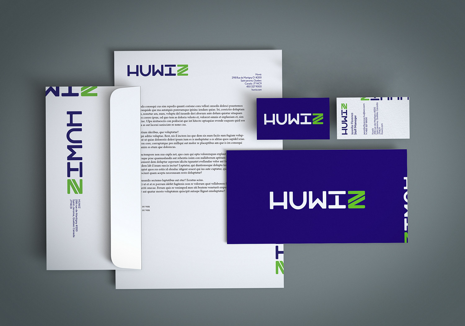
HUWIZ APPLICATION PROCESS
The objective? Identify, idealize, and create a proper substitute for a newly upcoming Canadian brand. Huwiz, a company focusing on quality assurance for many different digital applications such as video games, websites, and many others, was the chosen focus company. After exploring through research, competitive audits, personas, and creative brief approaches, we delivered a new and inviting logo. Using colors, many can incorporate with video games and coding; the ideal final project was a logo in which many can idealize who they are, their brand identity, activity, and ideals.
TEAM CLOTHING CONCEPT
The logo uses a geometric sans-serif typeface edited with kerning and positioning to create a unified wordmark. The (z) was replaced with a branding activity in mind, which is the angle brackets of the coding language. Both incorporated into the logo signify more than one thing, and their primary color, green, creates a unique focus that works well alongside their branding.
Incorporating branding into the logo alongside their public image was essential to create a unique and positive experience that followed the essential logo design criteria.
HUWIZ APPLICATION / SINGLE COLOR
Banner Exhibition Display
Banner Exhibition #2
Exhibition Setup
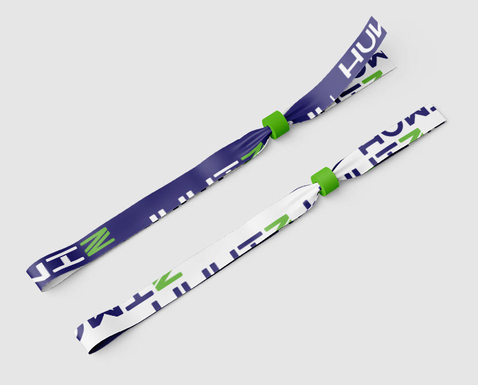
LANYARD
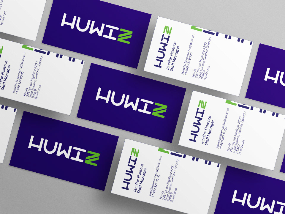
BUSINESS CARD MOCKUP
